
 1 year ago
75
1 year ago
75
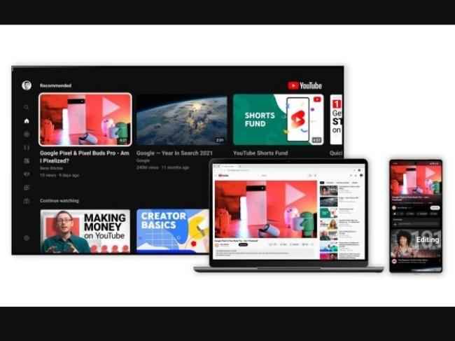
Youtube has introduced some intriguing app features to give its users a better interface experience. The upgrade also marks a significant strategic shift for the ubiquitous streaming service, and the YouTube team narrowed 100 concepts to a dozen, then to one. Then, following 30 separate user studies through many design sprints and meetings, they ultimately opted for the one they’ll release soon.
YouTube product manager Matthew Darby said, “The thing from my perspective is . . . we’re a very quantitative company. We’re good at focusing on growth and engagement metrics, but [we don’t] do so well with some subjective qualities. For example, what’s the subjective experience of watching a video, and did we lose some of that by optimizing a clickthrough rate on a button?”
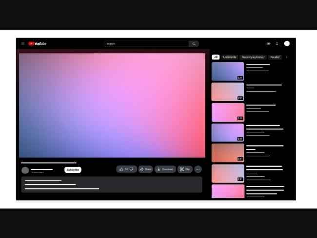
YouTube’s dark mode, formerly deep gray, is now a deep black. The choice was not only strategic but also a psychological hack to exploit the Bartleson-Breneman Effect, a perceptual theory that states when the background becomes darker, an image appears lighter. Therefore this change will make users feel like they’re watching content on their television.
Apart from redesigning the experience of watching a video, YouTube’s designers have also reconstructed the information hierarchy across the screen; the video’s creator has moved up and will now be visible on the page below the video, while the subscribe button will stay. Meanwhile, the thumbs-up and down buttons have buried a row down. In addition, the rectangular buttons and thumbnails inside the app have received the rounded corner treatment.
For more technology news, product reviews, sci-tech features and updates, keep reading Digit.in.


 English (US)